;fill-rule:nonzero;stroke:%23000;stroke-width:48.7px;'/%3e%3cdefs%3e%3clinearGradient%20id='_Linear1'%20x1='0'%20y1='0'%20x2='1'%20y2='0'%20gradientUnits='userSpaceOnUse'%20gradientTransform='matrix(2406.25,-2101.13,2101.13,2406.25,1086.43,2157.14)'%3e%3cstop%20offset='0'%20style='stop-color:%232d1f30;stop-opacity:1'/%3e%3cstop%20offset='1'%20style='stop-color:%239f5060;stop-opacity:1'/%3e%3c/linearGradient%3e%3c/defs%3e%3c/svg%3e)
Spoilers!
As part of my writeup of the
 CHCon 2025 Badge Challenge, I made some simple and stylish
components for hiding and showing spoilers. It only needs a few lines of Javascript and CSS:
CHCon 2025 Badge Challenge, I made some simple and stylish
components for hiding and showing spoilers. It only needs a few lines of Javascript and CSS:
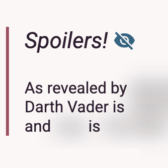
Spoilers!
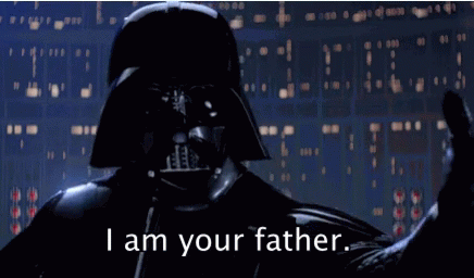
As revealed by The Empire Strikes Back, Darth Vader is Luke's father and Leia is his sister
Individual spoilers
Spoilers on websites are normally obfuscated until you press on them, or hover over them. Each spoiler works independently, so viewing one spoiler doesn't automatically expose you to other spoilers. In some cases, spoilers can have their own nested spoilers.
So far, everything is achieved with pure CSS:
.spoiler {
  filter: blur(10px) grayscale(100%); /* blur works well, grayscale further obfuscates images */
  /* these 'transition' properties affect the 'hover' → 'default' transition */
  transition-timing-function: ease-in;
  transition-delay: initial; /* no delay, blur immediately */
  transition-duration: 200ms; /* relatively quick transition */
}

.spoiler:hover {
  filter: initial; /* no blur, full colour */
  /* these 'transition' properties affect the 'default' → 'hover' transition */
  transition-timing-function: ease-in;
  transition-delay: 200ms; /* delay a bit, to reduce the risk of accidental reveals */
  transition-duration: 500ms; /* reveal takes a bit longer than blur */
}
Spoiler groups
To expose multiple spoilers at once and keep them visible, they can be grouped into a "spoiler group", where a parent container hosts multiple child spoilers.
| Room | Where you left your glasses |
| Bedroom | 2x in top drawer |
| Kitchen | 1x behind fruit bowl |
In this example, a simple event listener on the quote block toggles a
reveal CSS class:
<div class="spoiler-group" onclick="classList.toggle('reveal')">
  ...
</div>
We can add a .spoiler-group.reveal selector to the previous rules to
represent the relationship:
/* ... */
.spoiler:hover,
.spoiler-group.reveal .spoiler {
  filter: initial;
  transition-timing-function: ease-in;
  transition-delay: 200ms;
  transition-duration: 500ms;
}
Spoiler Toggles
For the last piece of the puzzle, we need a clear, visible, and accessible way to toggle spoiler
visibility inside a spoiler group. We can use a checkbox component inside the group to toggle
the spoiler group's reveal CSS class, and dress it up to look like a
two-state button with a Material Icons icon:
<label class="spoiler-control">
  <input type="checkbox"/> <span class="spoiler-icon"></span>
</label>
We use CSS to hide the checkbox, and toggle the icon based on the checkbox state.
/* minimise the checkbox while keeping it accessible */
.spoiler-control input {
  opacity: 0; width: 0; height: 0; margin: 0;
}

.spoiler-control .spoiler-icon::after {
  cursor: pointer;
  color: #376380;
  font-style: normal;
  font-family: 'Material Icons';
  vertical-align: bottom;
  content: "\e8f5" /* visibility off */
}

.spoiler-control input:checked + .spoiler-icon::after {
  content: "\e8f4" /* visibility on */
}
Putting it all together
Given the the spoiler toggle is nested inside the spoiler group, we can use the use the
checkbox's change event handler to walk the DOM and toggling the
reveal class on the nearest spoiler group. Here's a similar example,
with the spoiler toggle instead:
Section with multiple spoilers
Press the spoiler toggle to show or hide spoilers. There are several spoilers in this block, including the following table:
| Room | Where you left your glasses |
| Bedroom | 2x in top drawer |
| Kitchen | 1x behind fruit bowl |
This time, the spoiler control handles updating the reveal class on
the spoiler group:
<label class="spoiler-control">
  <input type="checkbox" onchange="closest('.spoiler-group').classList.toggle('reveal')"/>
  <span class="spoiler-icon"></span>
</label>
If you have feedback or questions about this article, let's catch up via Mastodon or email.

 All articles
 About Sinclair Studios